
Translating Headlines, Breaking Down the Levers from Macro to Micro (You!)
“Affordability” is the buzzword on everybody’s minds lately, but it is often used without a baseline. Here, we break down its use in the housing market and what variables are at play in this seemingly simple concept. You will get the models you need to make better decisions, stripped of the media hype.
Defining the Model
The widely accepted metric is New Homeowner Affordability: the share of income a median household spends on a newly purchased home, including mortgage, insurance, taxes, and maintenance. The common threshold for “unaffordable” is spending more than 30% of income on housing.
New Homeowner Affordability:

Visualizing the “Crisis”: 2012–2025
While Numbers and Math are supposed to be objective, the media makes them emotional, stripping context. The data below has been making the rounds, being described as “a crisis”. As of December 31, 2025, the US Average sits at 0.324.

Note: This “record” is based on Zillow’s dataset, which only tracks back to 2012.
Engineers know there is more to any story than just the mean. So we broke the headline down further to help visualize the data across the US and found massive geographic variance. Each light gray line represents one of over 350 different housing markets analyzed. The gray shaded area represents the middle 80% of U.S. housing markets.
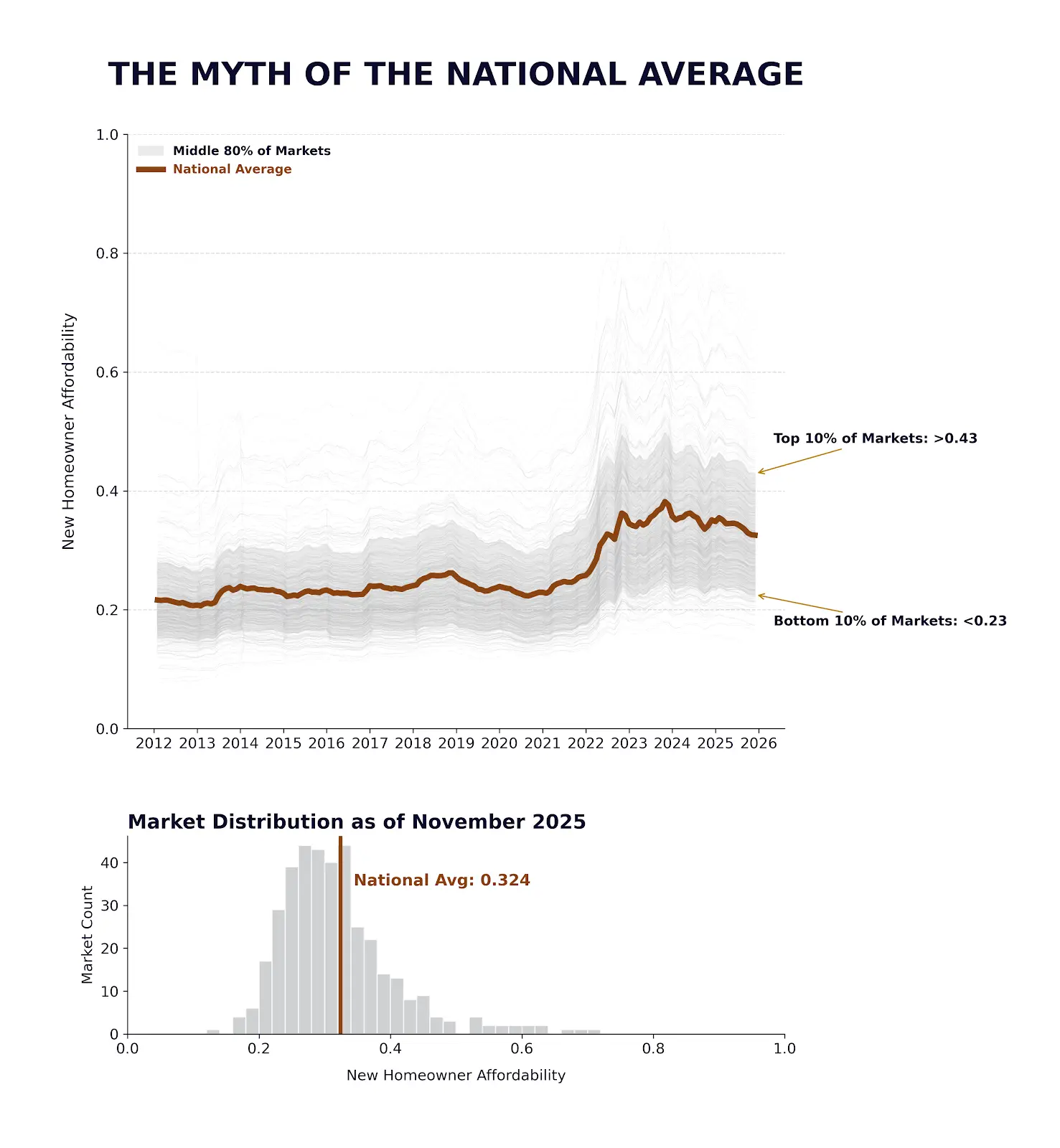
The average is a myth. Not in the way myths are not real, but that they are often based on reality and inflated to a point that they have mythological power. Average is a number, also known as a mean.
Now, imagine this is showing data for an engineering project, perhaps efficiency. You tell your boss, your products have an efficiency of 32%, but you neglected to tell them that 80% of them perform between 23-43% efficiency. Let me know how that goes- I’m always looking to work with former engineers.
In engineering terms, One Sigma (Standard Deviation) in this dataset represents a 13% shift in affordability. That isn’t just a stat; it’s the difference between 13% of your paycheck staying in your pocket or going to a bank.
We have more control over affordability than the media wants us to know. I built this interactive map to give you that control, to understand how the levers apply to your situation.

A Note on Affordability and Demand: Regional Reality
Before we evaluate based on the numbers, we must acknowledge the spread. I am currently in a Michigan region with a housing affordability ratio between 0.23 and 0.30. Statistically, this is very reasonable. Compare this to my previous homes between LA and San Diego, which sat at 0.67 and 0.57 respectively.
While it is -3°F in my lovely, practical state and 65°F in Irvine, CA. These numbers prove that “national averages” often obscure the subjective reality of specific markets that lead to our objective results.
Historical Anchoring: The 50-Year Cycle
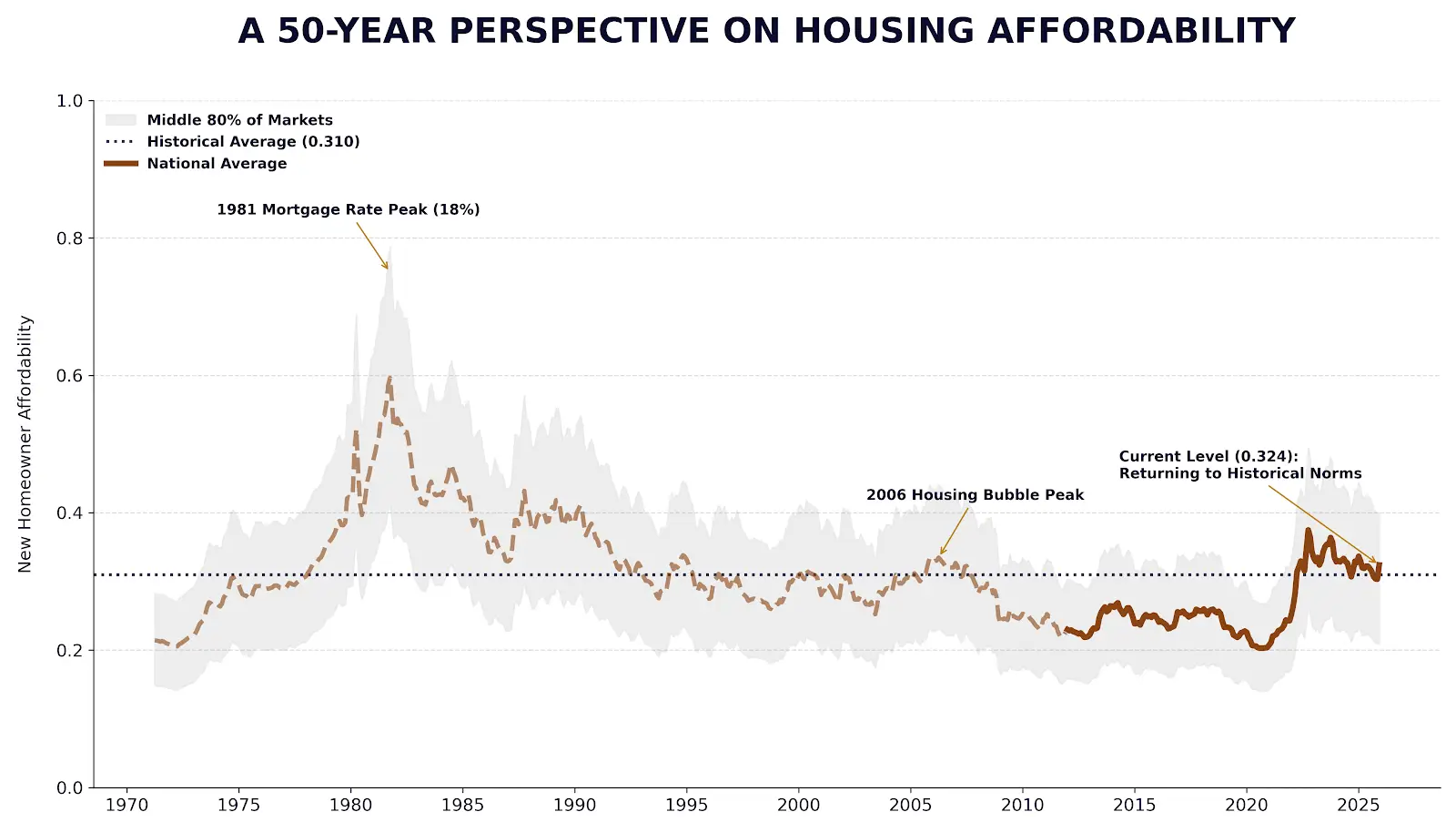
While the media screams ‘crisis’ at 0.324, a 50-year historical anchor reveals this is a structural normalization. We are reverting toward the 50-year mean of 0.310, moving away from the artificial, low-interest ‘floor’ of the 2010s.
Current data suggests a structural normalization rather than a catastrophe. The spike from 2021 to 2022 was driven almost entirely by the interest rate lever moving from 2.73% to 6.42%. Interestingly, increased household income during this period nearly neutralized the 20% surge in home prices.
Variable Sensitivity: Which Lever Moves the Needle?
To understand how to navigate this market, we performed a sensitivity analysis on our affordability engine. We varied each primary lever by 10% to see how it impacted the New Homeowner Affordability.

What the Math Tells Us
- Interest Rate is the Volatility Monster: While its per-unit sensitivity is slightly lower than price, it sits at the top of the risk hierarchy because it is the most volatile. Rates can double in a year, whereas prices rarely move that fast.
- Price is the Hybrid Heavyweight: While the market sets the mean price, you control where you fall in the statistical distribution. Our modeling shows that choosing a 1,500 sq. ft. floor plan over a 2,500 sq. ft. plan in the same zip code results in an average 24% reduction in price, which translates to an .084 shift in your affordability ratio. This single architectural decision can move a household from a “crisis” headline to a structural normalization—reverting from the 90th percentile back to the 50-year mean.
- Income is the Great Neutralizer: A 10% raise (movement to the left) almost entirely offsets a 10% spike in home prices. It is the only lever powerful enough to fight back against asset inflation.
Breaking Down the Levers
- The Macro Levers: The Fed sets the “risk-free” rate- indirectly affecting Mortgage Interest Rates. Regional supply and demand drives the base principle, through home prices.
- The Micro Levers: You can shop for insurance, negotiate your salary, and choose your “friction” by changing your down payment. Ultimately you decide what home works best for you, and that alone can swing individual affordability 0.15+. Collectively, these smaller levers are your path to control.
Are You Average?
Affordability has varied greatly over time and has no single equilibrium point. If you aren’t “average,” why fixate on the average headline?
Apply Affordability to your specific situation here: https://thefppartners.com/free-analysis-toolkit
Comments